Behind the Clicks: Dexola’s UX Audit for Trustee Plus Crypto Wallet

Trustee Plus is more than just a cryptocurrency wallet. The independent service is known for its user-friendly design and high-level security protocols. The team consistently improves product quality and, in turn, boosts revenue.
In February 2024, Trustee Plus partnered with Dexola, an insightful expert in Web3 design and development, to conduct a thorough user experience (UX) audit.
Our review of the Trustee Plus UX audit provides insights into what a comprehensive user experience checkup entails, identifies common errors and system issues that impact interaction with the application, and offers recommendations on how fintech services can enhance their products.
About Trustee Plus Crypto Wallet
Trustee Plus is a multi-currency wallet and digital finance platform designed to meet the needs of the growing digital finance community. It supports instant transactions and exchanges for over 30 coins and tokens, including Bitcoin, Ethereum, and stablecoins across TRC20, ERC20, and BEP20 networks.
With zero fees for various services and robust customer support, users can buy, store, exchange, and withdraw cryptocurrencies to bank cards and make payments with the Trustee Plus payment card via Google Pay or Apple Pay. The app has been installed over 500,000 times, with users performing up to 41,000 transactions daily.
Methodology Framework of Trustee Plus UX Audit
Despite stable audience growth and numerous positive reviews, Dexola’s audit aimed to further improve user experience by identifying strengths, weaknesses, and areas for enhancement. The audit employed two primary methodologies: Nielsen heuristics analysis and flow-specific usability analysis.
Nielsen Heuristics Analysis
Nielsen’s heuristics are ten general principles for user interface design developed by Jakob Nielsen. These principles help identify usability problems in a user interface so they can be addressed during the design process. Here’s a brief overview of each heuristic:
- Visibility of System Status [System Status]: Keep users informed about current activities with timely and appropriate feedback.
- Match Between System and the Real World [Real World Match]: Use familiar language and present information logically.
- User Control and Freedom [User Control]: Provide an “emergency exit” for users to quickly undo actions.
- Consistency and Standards [Consistency]: Follow platform conventions to avoid user confusion.
- Error Prevention [Error Prevention]: Design to prevent errors, providing users with the opportunity to confirm actions.
- Recognition Rather Than Recall [Recognition]: Minimize the need for users to remember information by making objects, actions, and options visible.
- Flexibility and Efficiency of Use [Flexibility]: Offer shortcuts for experienced users and options to personalize frequent actions.
- Aesthetic and Minimalist Design [Minimalist Design]: Avoid unnecessary information in dialogues to keep important details prominent.
- Help Users Recognize, Diagnose, and Recover from Errors [Error Recovery]: Write clear error messages that identify issues and provide solutions.
- Help and Documentation [Help & Docs]: Offer searchable, task-focused help guides with clear, concise instructions.
Flow-Specific Usability Analysis
Dexola focused on the most common and critical actions for Trustee Plus users, covering 20% of use cases that provide 80% of user needs. The audit concentrated on these use cases:
- passing KYC verification,
- buying crypto with a fiat card,
- using the Trustee Plus card to pay,
- receiving crypto,
- sending crypto.
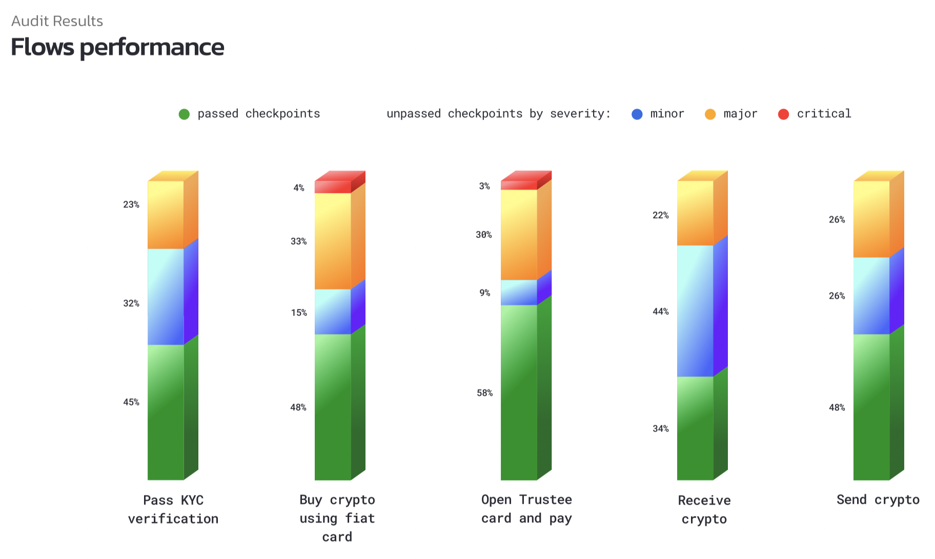
Scoring
Findings were scored based on the user’s task and context to prioritize fixes:
🔵 Minor: cosmetic or consistency issue causing slight irritation;
🟠 Moderate: occasional task failure for some users, causing delays and moderate irritation;
🔴 Critical: task failure causing extreme irritation.
Audit Results
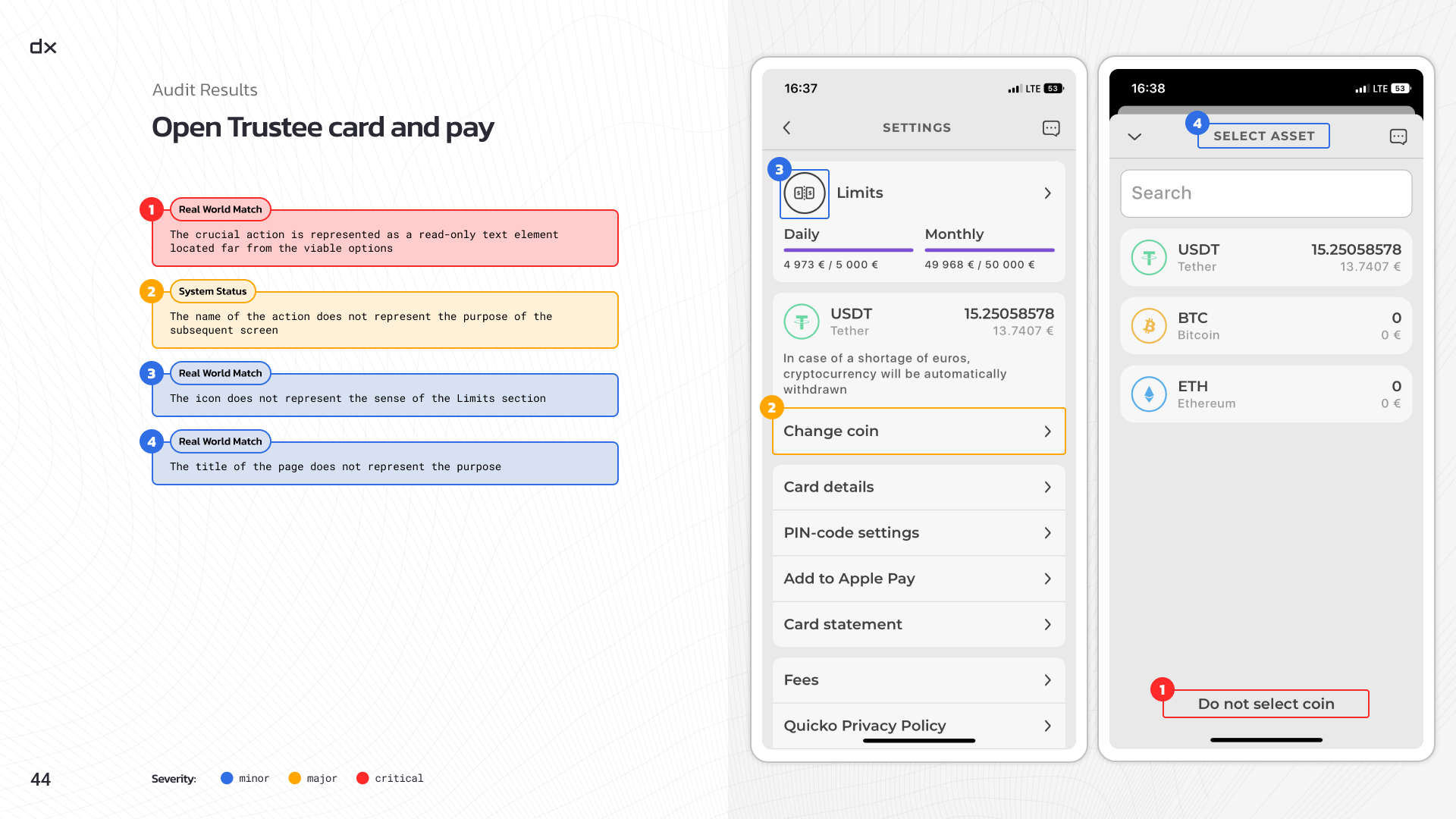
The full UX checkup revealed numerous minor and moderate issues and a few critical ones, all of which were promptly addressed by the Trustee Plus team. Here are some key findings.
Visibility of System Status — 39 findings:
- Poor visibility made it hard for users to know if their actions were effective;
- Lack of clear feedback impeded decision-making;
- Inconsistent presentation of information caused disorientation.
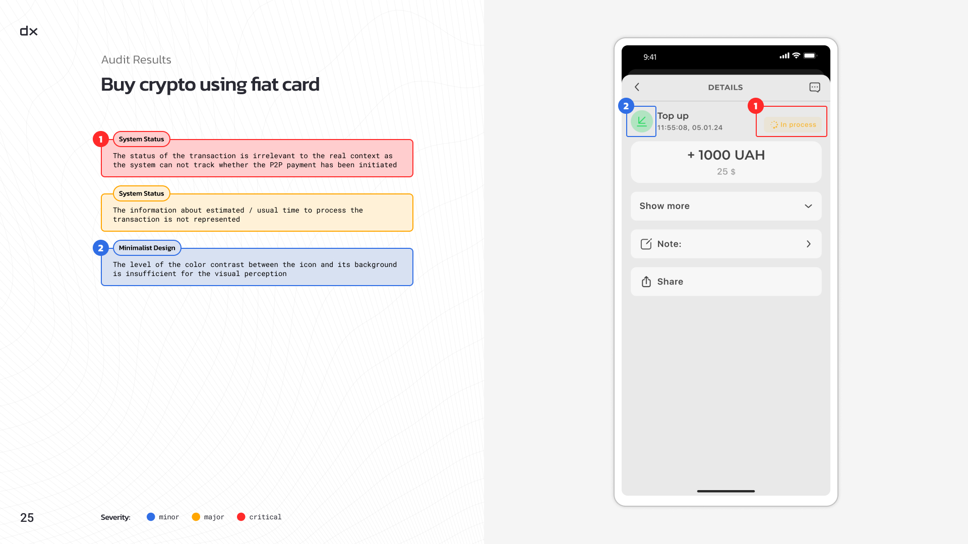
2. Match Between System and the Real World — 27 findings:
- Misalignment with users’ mental models created cognitive dissonance;
- Users had to spend more time adapting to the system;
- Misunderstanding feedback led to mistakes.
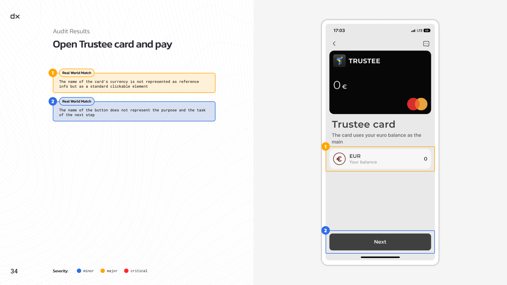
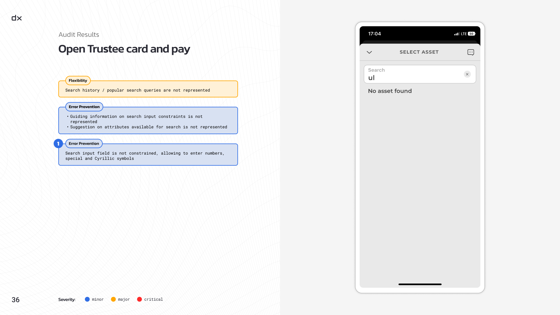
3. Error Prevention — 19 findings:
- Unclear errors left users unaware of mistakes;
- Vague error messages offered no guidance;
- Intrusive error prevention disrupted workflows and annoyed users.
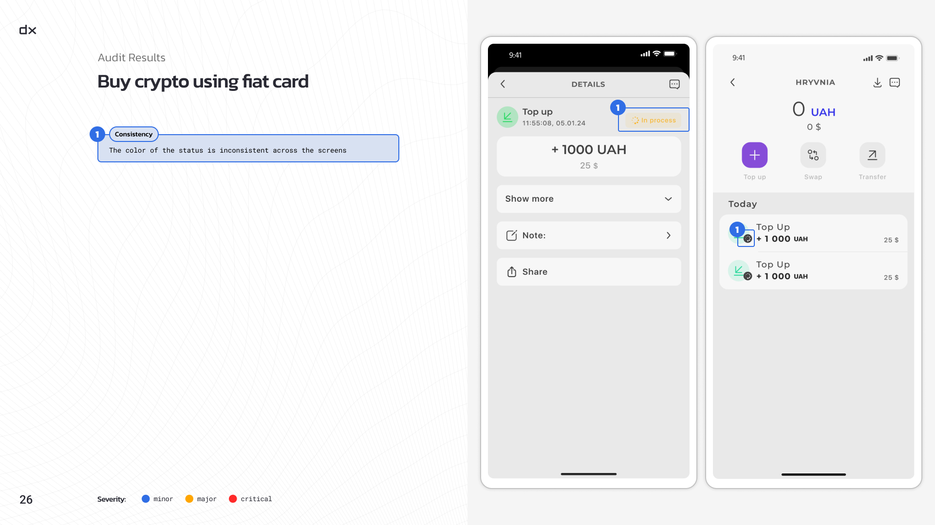
4. Consistency and Standards — 14 findings:
- Inconsistent UI elements increased cognitive load;
- Users had to adapt to varying patterns, increasing the learning curve.
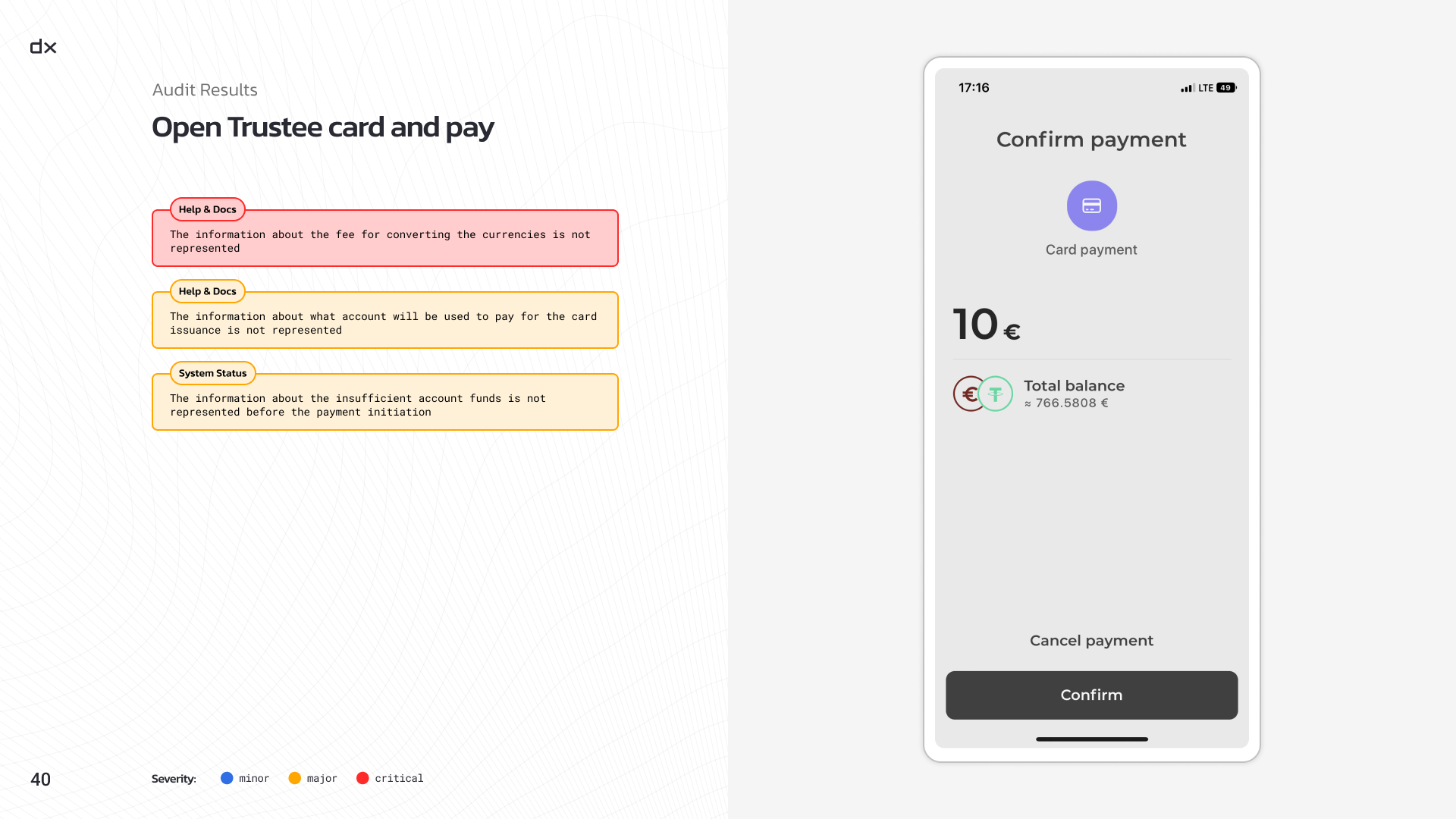
5. Help and Documentation — 13 findings:
- Outdated or confusing documentation misled users, causing errors.
Recap
The UX audit conducted by Dexola for Trustee Plus crypto wallet highlighted key areas for improvement, revealing a number of minor and moderate issues along with a few critical ones.
By addressing these findings, Trustee Plus has taken significant steps to enhance user satisfaction and upgrade interactions. The audit underscores the importance of regular UX evaluations in maintaining a user-friendly and efficient digital finance platform.
If you’re also looking to optimize the user experience of your web3 project and want a detailed audit, hit us up for a free consultation.