Web3 UX Design: Importance, Challenges and Best Practices

While crypto has been around for nearly a decade and is no longer in its infancy, it still falls under the category of emerging tech and is yet to achieve mass adoption. Still, one of the biggest challenges web3 and crypto continue to face is being accessible and easy-to-use at scale.
To start with crypto, the average user needs to: have a general understanding of what it is and how it works, install a wallet and save the seed phrase, and top it up with some cryptocurrency. These seemingly small requirements in reality create a significant entry barrier. And it’s become even more challenging when it comes to new token standards like BRC-20. It is due to the lack of convenient infrastructure (platforms, websites, exchanges, wallets), the need to work directly with JSON objects, and the high gas prices.
As more and more users onboard into the world of web3, thoughtful UI and UX will continue to play a significant role in making crypto more accessible.
UI vs. UX
UI (User Interface) and UX (User Experience) design are both critical components of creating digital products. While the two terms sometimes get used interchangeably, they refer to different aspects of the design process. UI design focuses on the visual aspects of the product, including the layout, fonts, and color scheme. On the other hand, UX design is concerned with the overall experience of using the product. It including how easy and intuitive it is to navigate, how well it meets the user’s needs, and how engaging and enjoyable the experience is. In short, UI is about how a product looks, while UX is about how it feels to use it.
Web1, Web2, Web3: What Does This Mean for Design?
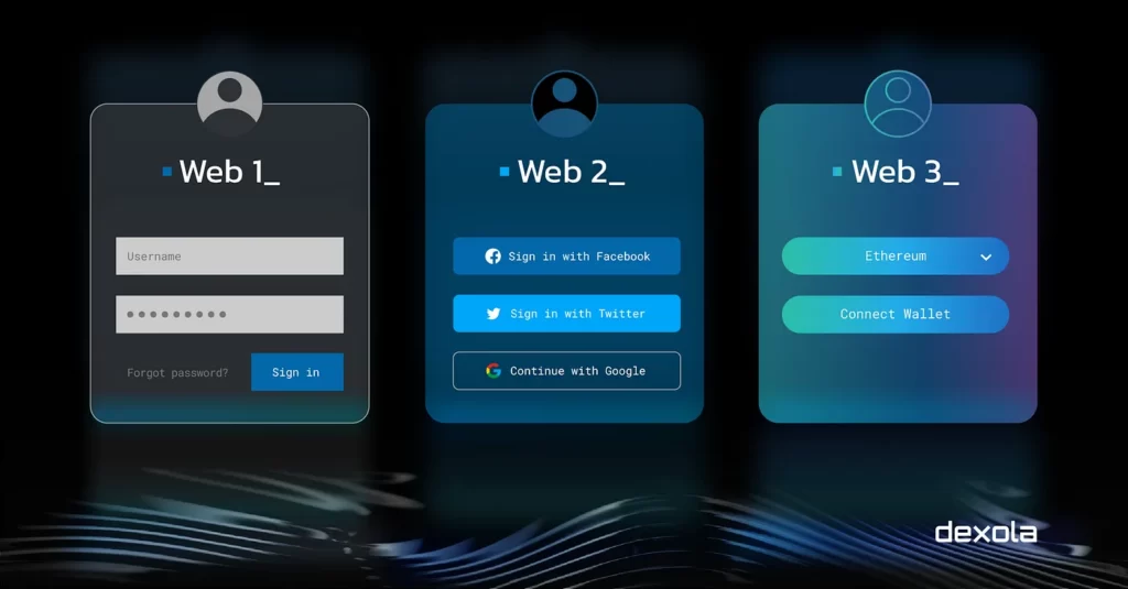
The evolution of the Internet from web1 to web2 and now to web3 has had a profound impact on design practices. Over the years, design and UX were passing through the path of complication, and the problems that could be solved with design became more challenging.
In the early days of the Internet, static websites dominated, focusing primarily on delivering information. With the advent of web2, user interaction and participation became the driving force, leading to dynamic and interactive centralized websites. Web3 takes this a step further by leveraging blockchain technology to enable decentralized applications and platforms. This paradigm shift in technology requires a new approach to design, where UX plays a pivotal role. If web2 UX challenges lay mostly in the plane of the visual architecture of multi-user systems, web3 requires both design and a deep understanding of underlying technology to get right.

Web3 UX: Blending Technology and Design
Web3 UX is a unique blend of technology and design that demands a multidisciplinary approach. Unlike traditional UX design, which focuses on creating visually pleasing interfaces that are easy to use, web3 UX design requires a deep understanding of blockchain technology and the ability to translate its complexities into an intuitive design.
Vitalik Buterin in his closing speech at ETHDenver mentioned that the two things that keep users using the centralized solutions are fees and user experience. To solve the second one, it’s not only enough to come up with a great design:
Sometimes there is a need to implement a solution that is ugly and not sweet. It doesn’t try to be optimal, but instead, it tries to be robust and provide a clear solution even when things fail. It’s important to process the very specific user experience issues that annoy people.
Web3 UX Principles
Improving user experience for blockchain applications requires adherence to best Web3 UX design practices and principles since web3 provides completely new interactions with users. These principles focus on simplicity, clarity, security, and ease of use. Previously known UX patterns from web1 and web2 are simply not enough to solve the problems that web3 brings to us. Some key web3 UX principles include:
Simplicity
Blockchain applications should prioritize clean and minimalist UX that presents enough information to users without overwhelming them. Due to the significant amount of technical information and new data points presented to the user, the main focus should be on helping the user understand the product regardless of their past experience, knowledge, language skills, or concentration level.
Communication Using Value, Limiting Technical Jargon
Catering to all audiences is one of the big challenges in Web3 UX design. If you have to use technical jargon, try to clearly explain what you mean by it. The communication should emphasize the value of the product, rather than using technical language that may confuse users.
Familiarity
By designing interfaces that are familiar to web2 users and using the best web2 UX principles, web3 applications can increase accessibility and adoption. This pattern can help users feel more comfortable and confident when interacting with blockchain-based applications.
Education
Constant education is one of the most important principles of web3 UX. As users interact with decentralized applications, we need to make sure they are guided through the whole journey. As of now, most people don’t understand the processes and functions in the blockchain field, making it crucial to provide information in small, easy-to-understand pieces explaining the specific details and concepts.
Security and Transparency
It’s a known fact that web3 is hacker/pirate/phish/scam-friendly, and security is a fundamental aspect of blockchain applications. Designing UX with a strong focus on security features ensures that users feel confident and protected while interacting with web3 platforms. Also, crypto apps sometimes make users take irreversible financial decisions without any third party protecting them from fraud or a simple mistake. That’s why being open and communicating about your security measures will likely increase the trust users will have in you and your product — make sure to let users know what data is handled, how it is handled, where it is stored, and why it is needed.
How to Achieve the Desirable UX?
Achieving a desirable UX in web3 requires a multidisciplinary approach. Here are some suggestions that can help to improve user experience in crypto and blockchain projects:
Explore Technologies
By staying up-to-date with the latest technological advancements, UX designers can incorporate new features and functionalities into their designs, enhancing the overall experience for users. Additionally, utilizing the most recent findings and discovering new ways of solving problems will help to create more efficient and effective solutions.
Wording Matters
There’s also a huge focus on UX copywriting for web3 user experience design, the practice of writing carefully considered information that addresses people’s contexts, needs, and behaviors. Make sure to explain complex concepts in simple words to let users understand them. For example, the “secret phrase” wording may work better than the “mnemonic phrase”. Using simple and clear messaging and communications is thus essential, especially during any transaction stages where users might face the risk of permanently losing their money.
Collaboration Between Developers and Designers
In the world of UX and Web3 design, designers need to have a deep understanding of blockchain technology, while developers should be aware of the importance of creating a user-friendly interface. This requires close collaboration between the two disciplines, which can help to ensure that the end product is both technically sound and intuitive to use.
Search for Solutions in the Development
It’s worth mentioning that the solutions to many web3 UX problems lie in the development process rather than in design alone. Let’s take the transaction fees as an example. While the UI can make it clear how much a user will be charged for a transaction, it is the development process that determines the fee structure and how it is calculated.
Impress with Creativity, but Don’t Distract from Features
How to improve UX in web3 design? Many web3 are similar to games and only Gen Z people can fully leverage them. While it’s important to create visually appealing interfaces that engage users, it’s equally important to ensure that the interface is intuitive, easy to use, and does not overwhelm users with gamification. UX specialists need to aim at striking a balance between creativity and usability, making it easier for users to interact with blockchain-based products.
Step Back to Web2
Surprisingly, one of our top tips for web3 UX design is that the greatest web3 experience can often be achieved by reimagining web2 interfaces. The target audience for web3 applications is primarily comprised of web2 users. These users are accustomed to a certain level of usability and functionality. To move forward in the world of web3, we must first go back and understand the needs and expectations of the existing user base. That way, you create a smoother user experience for people that are still new to things like crypto wallets, blockchain technology, NFT marketplaces, etc. Basically, a successful UX design with Web3 is the best web2 UX principles topped up by greater technological expertise.
While Web3 promises a future of decentralized finance (DeFi) and user-owned data, the technology feels intimidating for newcomers. By securely reimagining Web2 interfaces, Web3 UX design bridges the gap for users unfamiliar with crypto wallets, blockchain networks, and dApps (decentralized applications). This familiarity fosters trust from users in a new finance ecosystem. Ultimately, a successful Web3 UX design should integrate these powerful tools into an existing understanding of user experience. This helps build a strong brand for your company.
How Dexola Overcomes Challenges in Building a Web3 UX Team
We at Dexola approached the challenge of building a web3 UX agency with a unique solution. As a starting point, we had our own solid team of blockchain developers and designers, a research and development team, and a team of experienced web2 UI/UX designers in our parent company Trinetix who were willing to try themselves in the blockchain field.
We mentioned, that the web3 UX problems can’t be solved with the design only, that’s why we came up with a blockchain educational program for web2 design specialists. As a basis, we chose the “Crypto Literacy and Blockchain” course from Diia.Osvita, which provides a great general overview of the field. After completing the course, we involve these specialists in our R&D unit where we learn the best UX patterns within the scope of each application. Designing for UX in web3 includes developing typical solutions like wallets, exchanges, and NFT marketplaces with strong cross-communication between design and development teams.
Web3 UX is in a way still uncharted territory, and Dexola identified succeeding in it as a specific challenge at another level of complexity. We believe that by leveraging the expertise of web2 designers with over 10 years of experience and providing them with technological education, we can deliver a world-class UX for blockchain products.
Read more about how to create a crypto trading bot and smart contracts development by Dexola.

